Station displays
Creating a new design system for station displays across the Transport for London network.
Transport for London (TfL) is a government body responsible for the transport system in Greater London.
The services TfL operate include London Underground, London Buses, Docklands Light Railway, London Overground, TfL Rail, London Trams, London River Services, London Dial-a-Ride, Victoria Coach Station, Santander Cycles and the Emirates Air Line.
Every day more than 31 million journeys are made across the network. The Underground has been an integral part of London’s history for 150 years. The network has expanded to 11 lines, and in 2015–16 carried 1.34 billion passengers. The 11 lines collectively handle approximately 4.8 million passengers a day.
As London grows and the TfL network expands to accommodate demand, stations are becoming busier and more complicated environments to navigate.
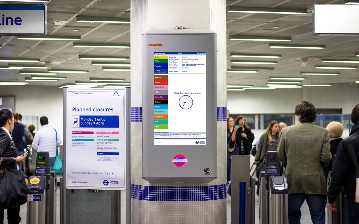
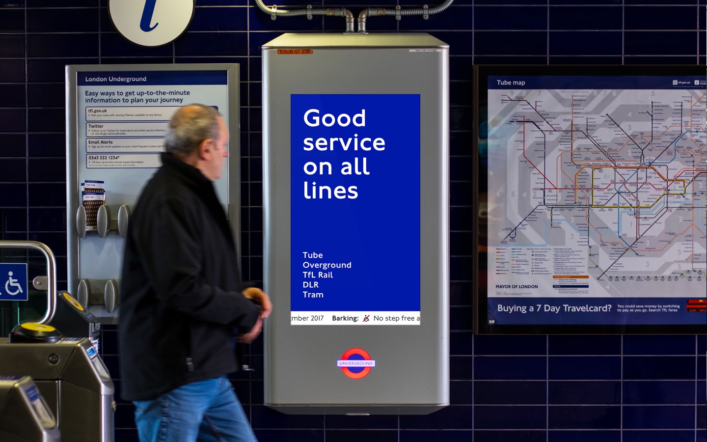
Station displays are designed to provide customers with accurate and timely Real Time Information (RTI) in order to enable them to make informed decisions about their journey options. There are over 400 of these displays located across the London Underground network.
Customer research identified that station displays were failing to support customer needs and highlighted the following issues:
Text and interface is difficult to read from a distance
Hard to scan for relevant information on the move
Not adaptable to screen size and orientation
Does not scale for future growth of the network
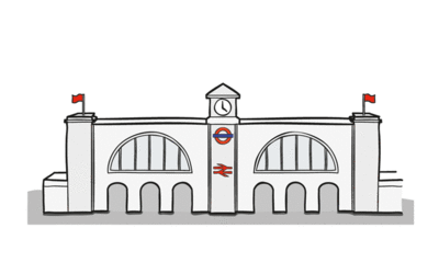
Station display in King's Cross St. Pancras northern ticket hall
The key objective was to redesign station displays so that customers could read and understand service information, allowing them to make vital decisions quickly. The system needed to be capable of handling the pressures of multiple issues affecting the network in a useful, simple and intelligent manner.
I led a team of designers (UX, visual and researchers) to run a series of design cycles over the course of six months. These cycles were split into short, defined sprints that delivered a user-centered solution sensitive to the needs of the business and technical constraints.
I reviewed existing research, explored design theory and conducted customer and staff interviews, to better understand information needs.
The team and I created a prototype using live data that we trialled with customers and staff in four underground stations, spending a week in each location capturing feedback.
I developed a design system and service application based on learnings from the trial.
The first step of the project was to get a better understanding of the problems faced by customers in the station environment; exploring how these impact mindset, cognitive load and the end-to-end travel experience
I spent several weeks sourcing research to ensure we were clear on existing insight and to avoid duplication of work.
My understanding of user needs at this stage was a little light, so I decided it was important to get some first-hand experience.
The team and I visited 3 different stations and conducted customer and staff interviews. We asked questions about travel habits, information needs and screen usage.
We also ran observation activities to better understand behaviour in the station environment.
I reviewed all the TfL touch points and third party apps to see how they were implementing real time information.
There are many departments, people and systems involved in delivering real time information. I ran workshops and interviews with key stakeholders to understand their needs and objectives.
I ran a mapping workshop with the project team to better understand the landscape and complex environment. Identifying how and when digital service screens fit into the end-to-end experience.
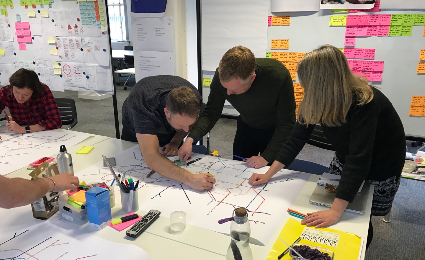
Experience mapping workshop with team
I researched similar design systems, such as the ambitious British Road Sign project, launched in 1965. Both experiences had a lot in common in that users needed to be able to make quick decisions about direction of travel whilst moving. Their effective system used shapes for different types of identification signs with legible type and bold pictograms.
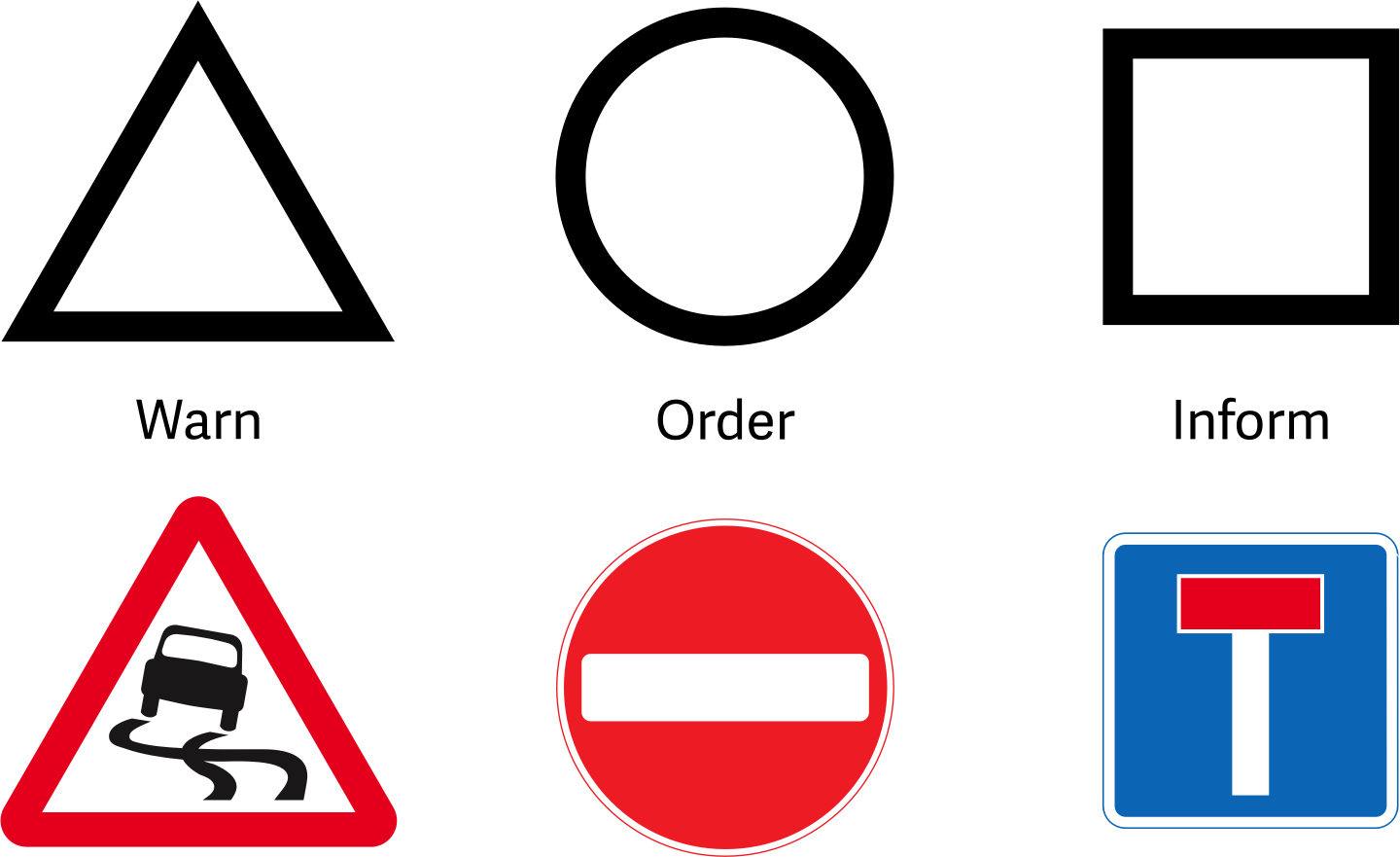
Using shapes for different types of identification signs
There was a huge amount of new and existing research. To help with analysis, I decided to create a project war room to gain clarity and to effectively guide stakeholders through my thought process.
I visualised key insight, considered how it affected the current experience, and how I could potentially prioritise short and long-term objectives.
Visualising key insight to help define objectives
During the discovery phase I identified huge issues with the location of some displays. In older listed stations some screens were completely hidden or obscured by architectural features. However, due to budget and planning restrictions, the decision was made to backlog the issue.
The short-term objective was to focus only on content redesign and deliver a system that could support key user needs identified from the research:
Display actionable advice which helps last minute decisions on-the-go
Deliver clear, bold, digestible design that works from a distance and whilst on the move
Localise information so that important updates can be spotted easily
Ensure design is consistent, regardless of display size or orientation
Display timely content showing relevant service information at different times
Ensure design is scalable and can include additional useful information in future
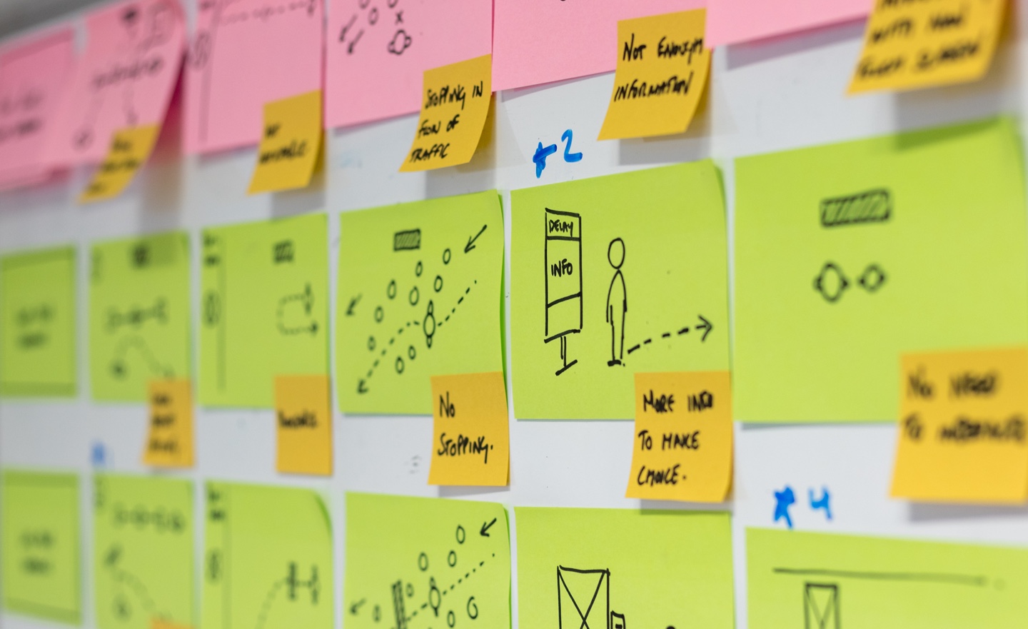
Firstly, I focused on sketching concepts that I thought may solve the identified issues. I spent quite some time in this phase; iterating, developing and testing different routes.


Sketching concepts
Sketching concepts
Sketching concepts
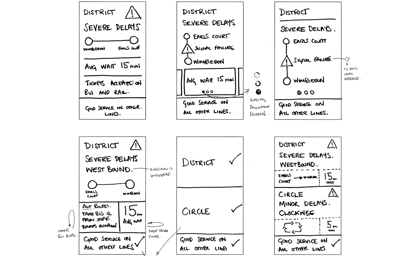
Sketching concepts
Sketching concepts
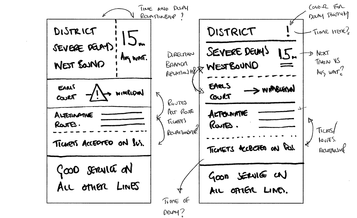
Once the team had internally agreed a direction, I started to see how this would look and function on a real station display. I created some assets and acquired a unit to test on.
Prototyping for testing
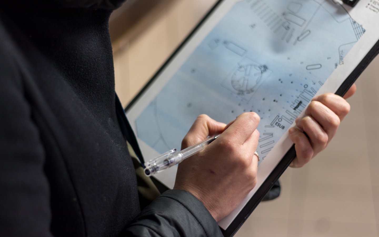
The team and I developed the design to handle different scenarios and created an HTML prototype to test with RTI data.
Developing design
After developing the prototype, I decided the best way to validate our approach would be to trial with customers and staff in a live station environment.
The team and I visited four stations and conducted a week of research in each to understand the environment and trial the design.
Gateway station
Destination station
Metro station
Local station
We interviewed a broad range of customers to understand their need for real time information and their use of displays.
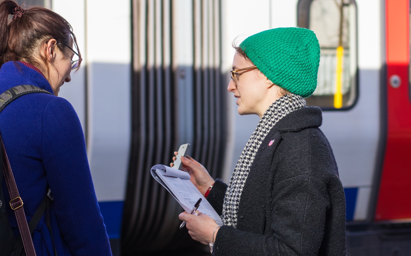
Interviewing customers at West Hampstead station
We interviewed front line staff to learn how they use station displays and discover their future expectations of these units.
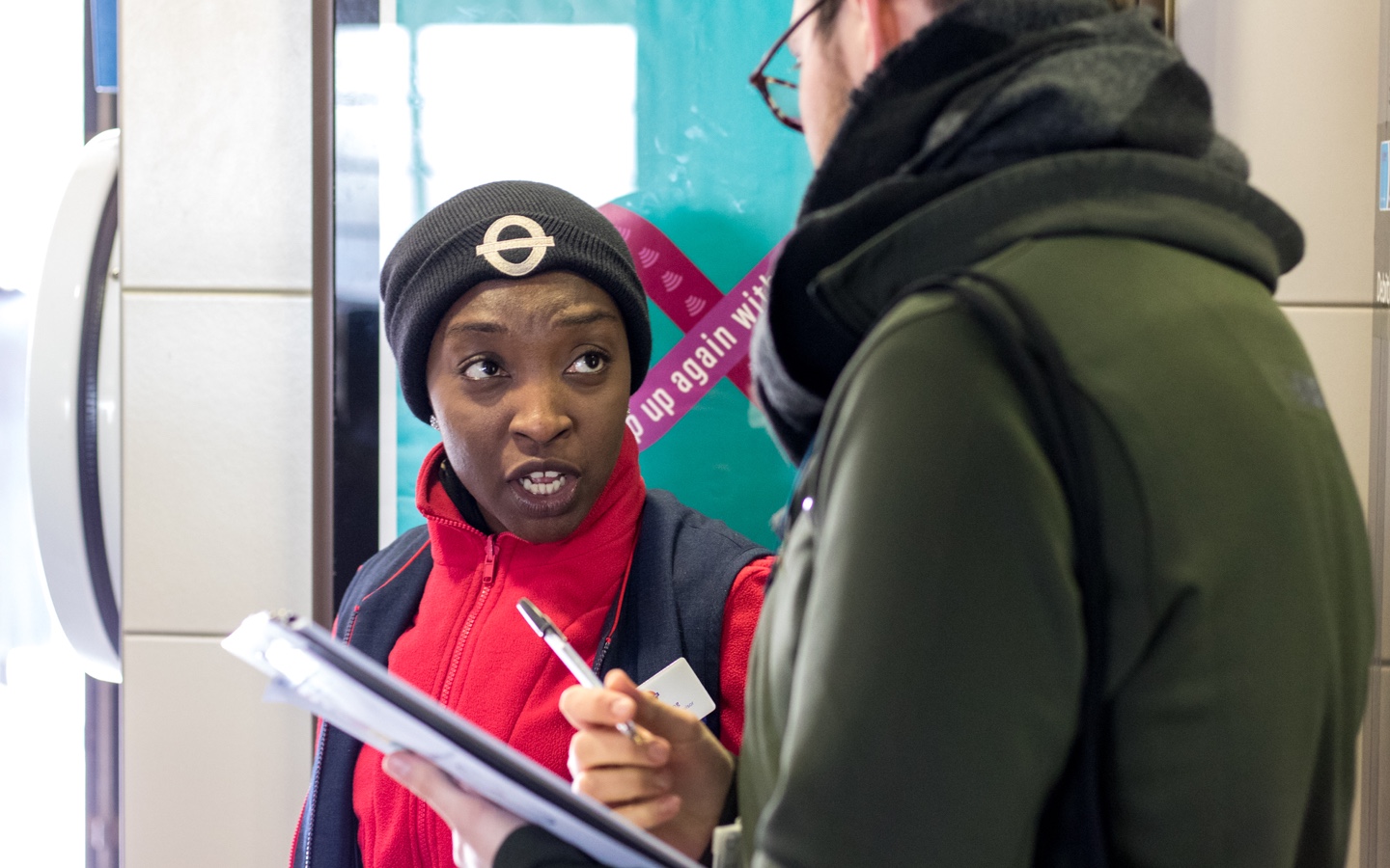
Interviewing staff at West Hampstead station
We mapped each station environment to discover interaction patterns and understand the role of displays.
Observing interaction at Leicester Square station
On completion of the trials, the prototype was updated to include key insight. After multiple cycles of iteration and testing, the team felt in a good position to move into full delivery and initiate roll out across the network.
I worked closely with the development team, assisting with front-end code, to deliver a new design system with the following improvements:
Text size increased to help viewing from a distance
Overlay text removed to eliminate any contrast issues
Local disruption information prioritised
Unnecessary information removed to improve focus
Repeated content removed
Moved from using legacy feeds to unified API
Imagine you've just arrived at Waterloo station and are looking to travel into central London. The example below shows how the old and new screen would present the same real time information on a disrupted day.
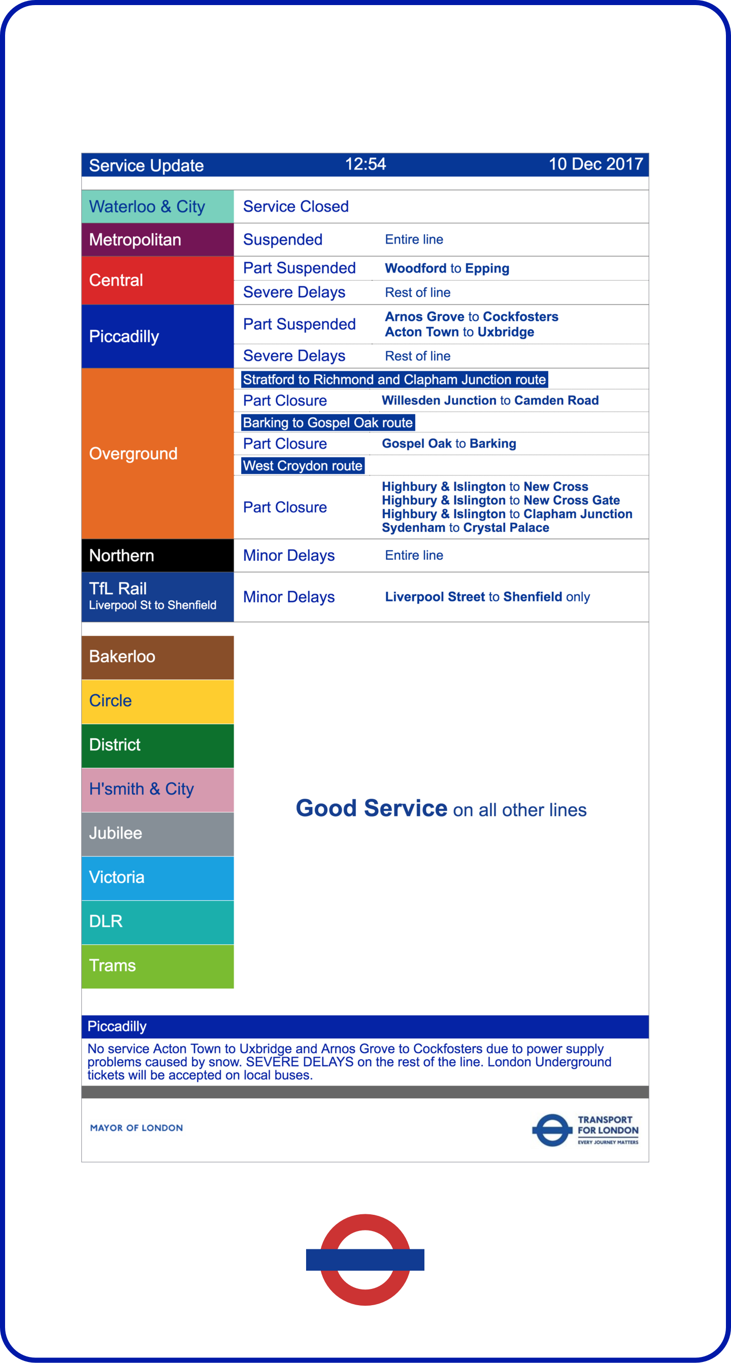
Old

New
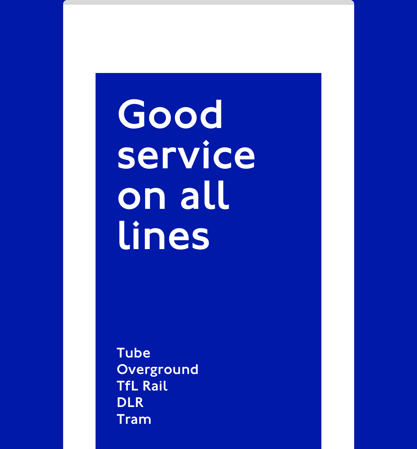
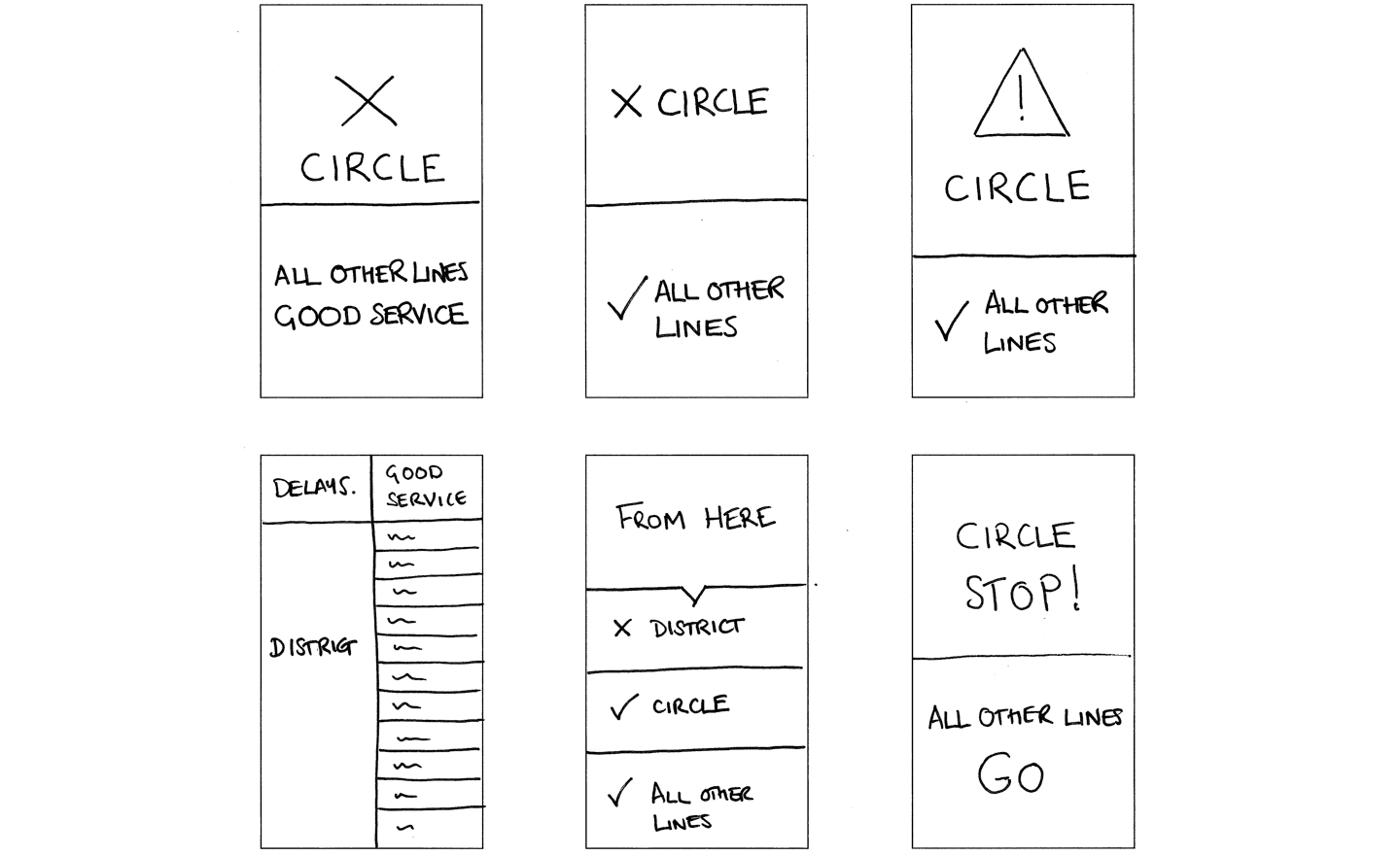
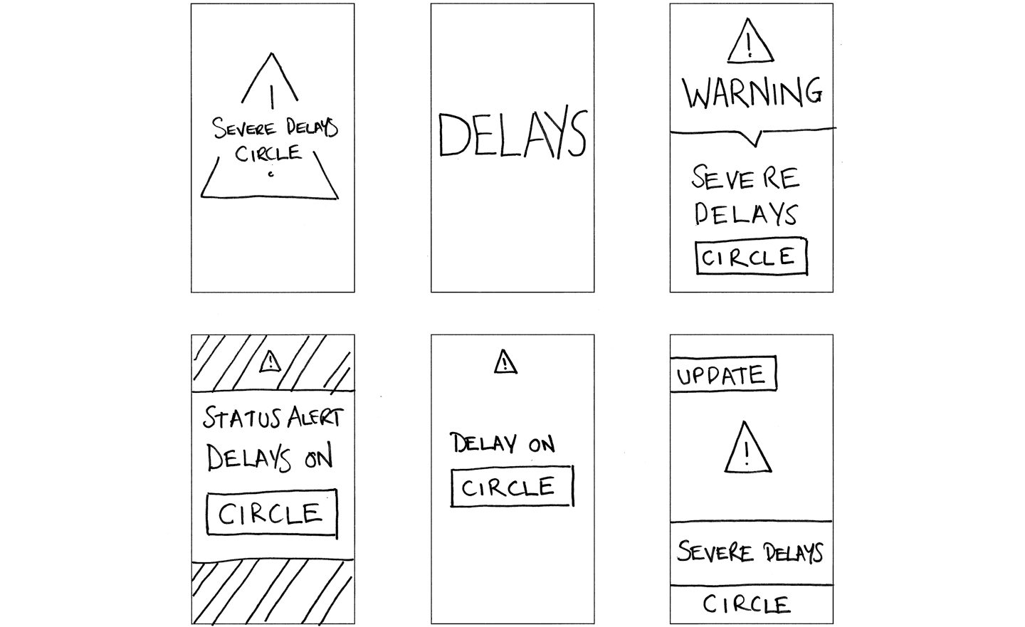
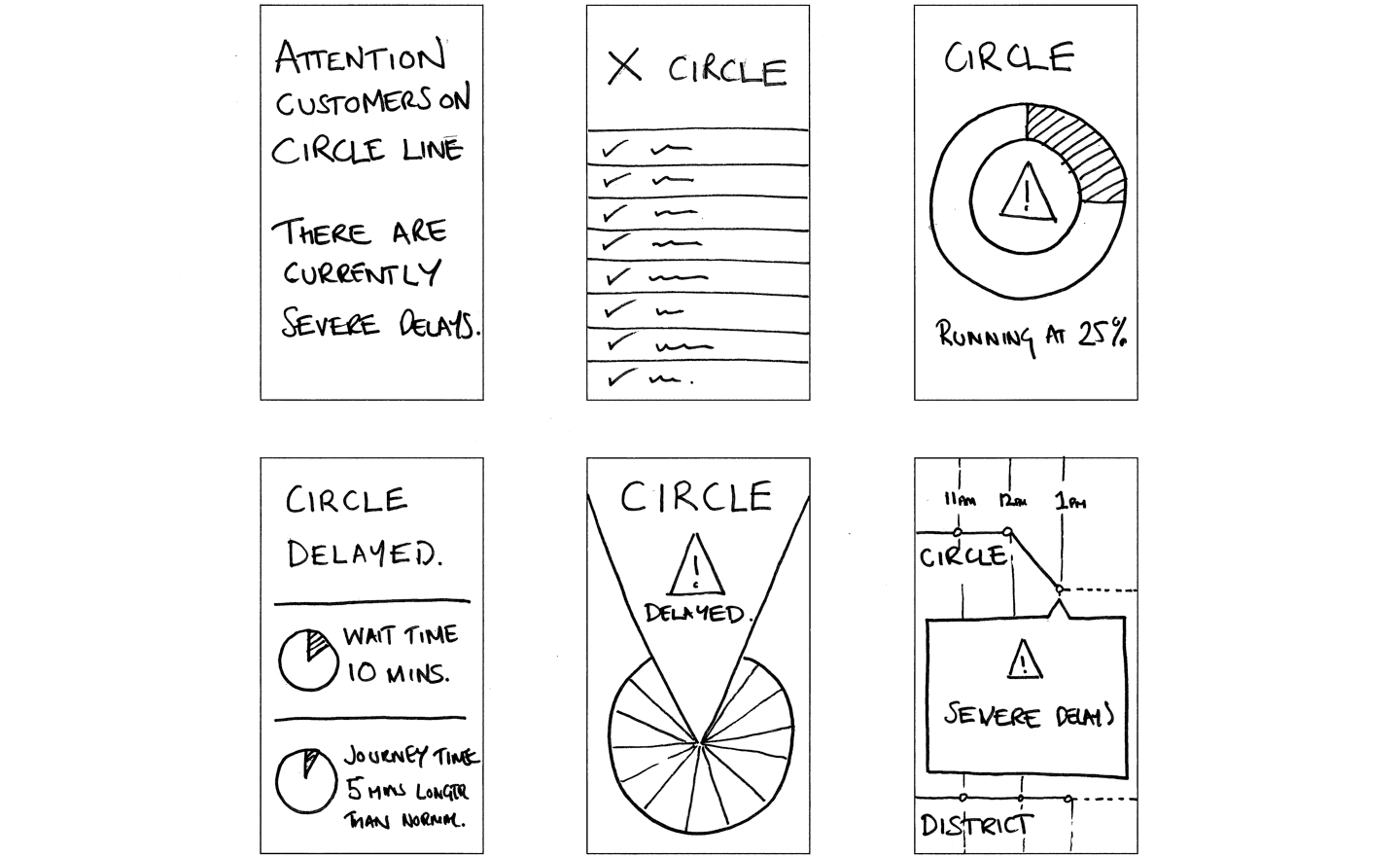
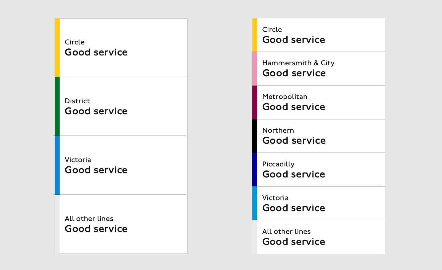
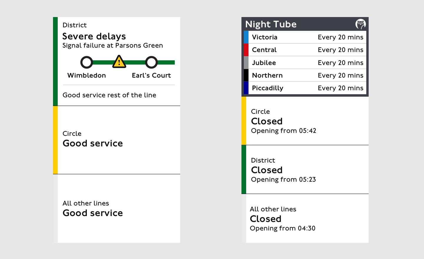
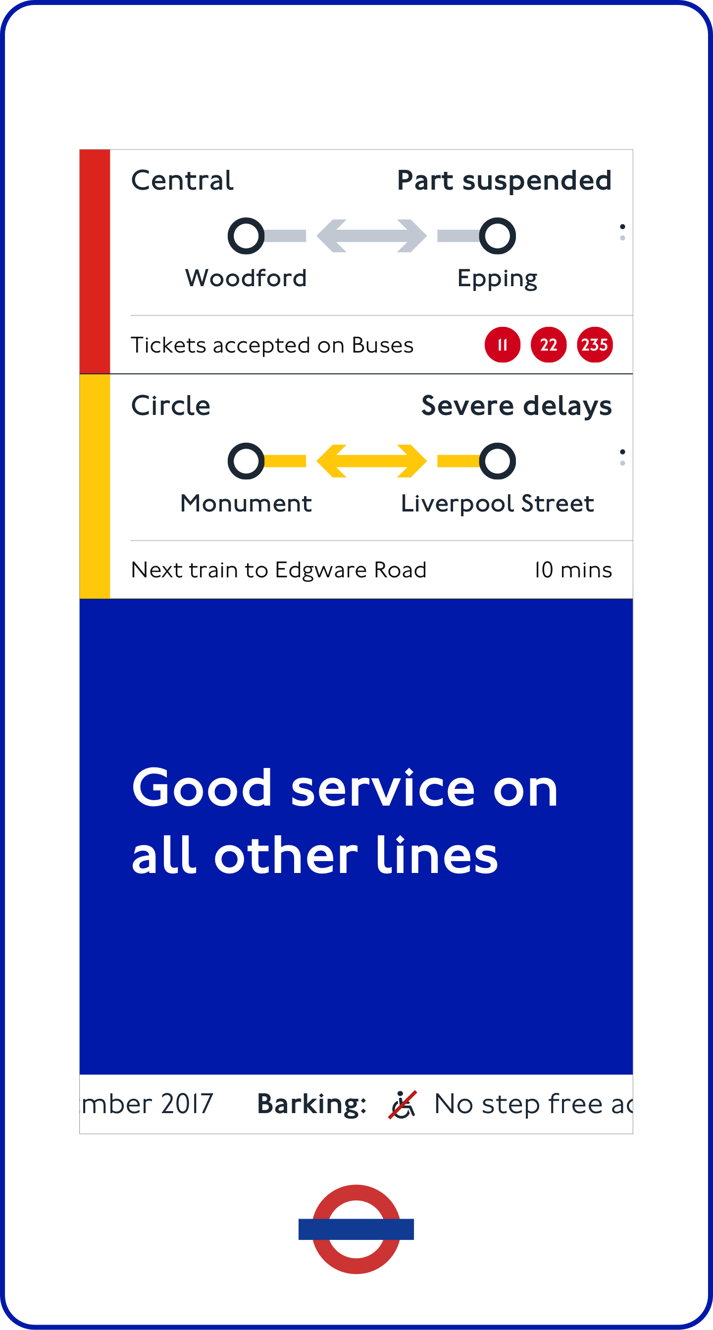
The design system has the flexibility to adapt to different service scenarios.
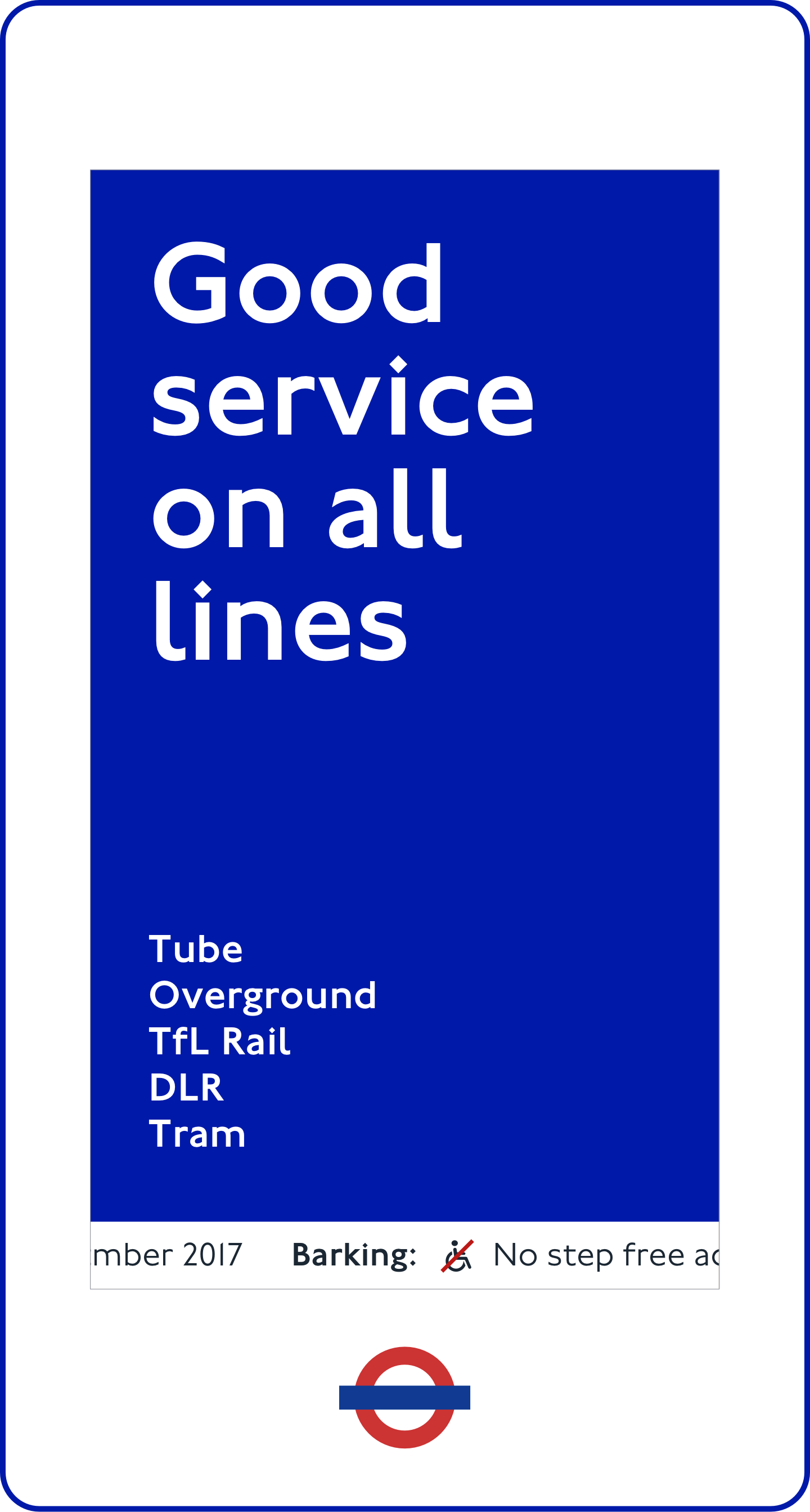
Good service
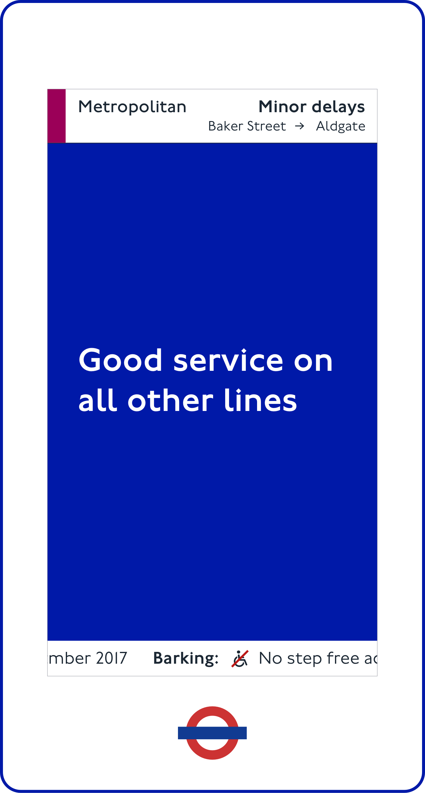
1 line disruption
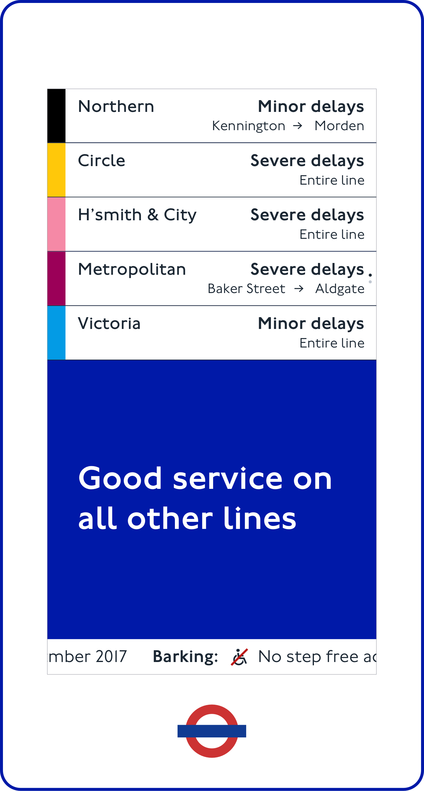
5 line disruptions
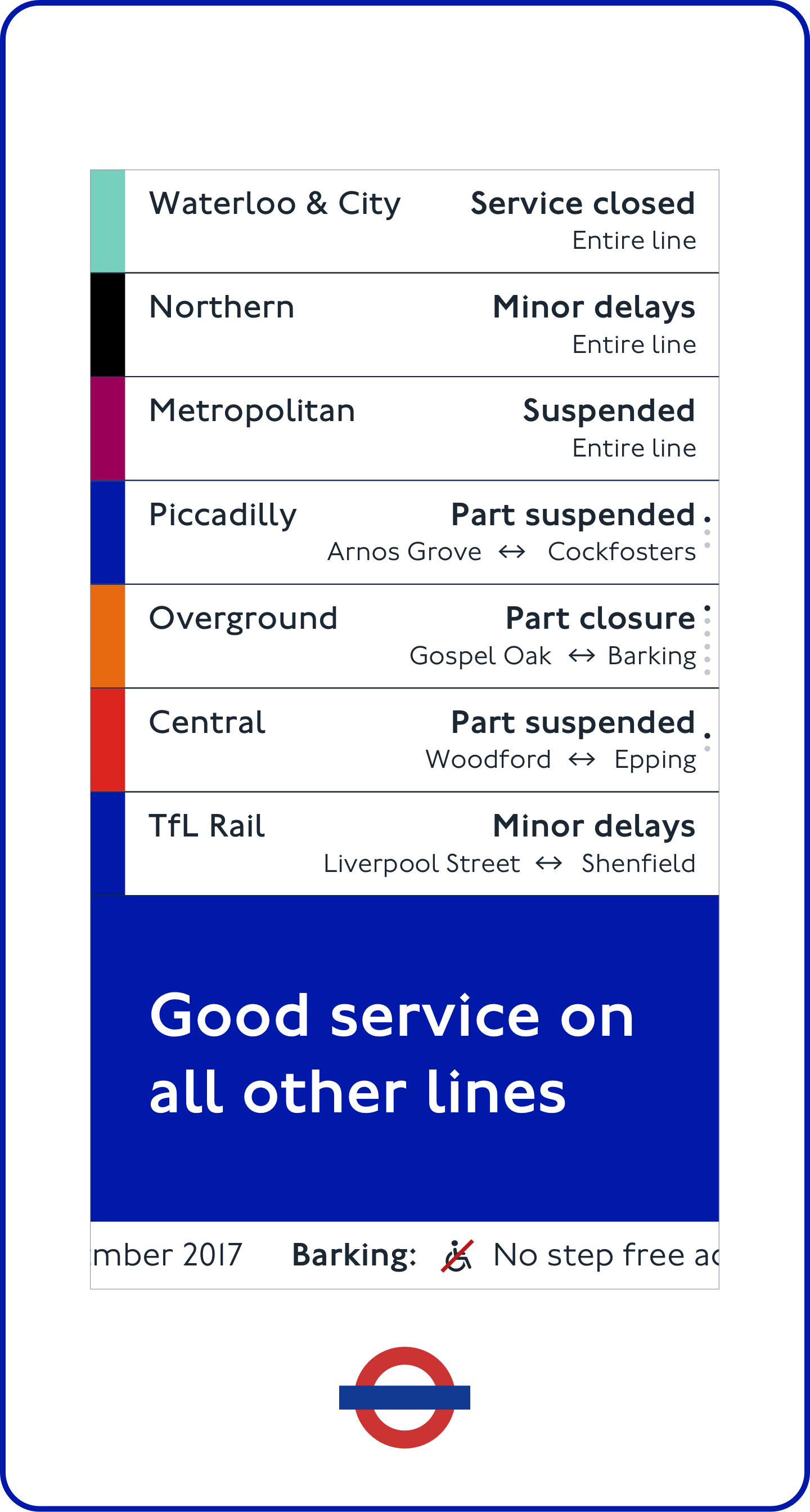
7 line disruptions
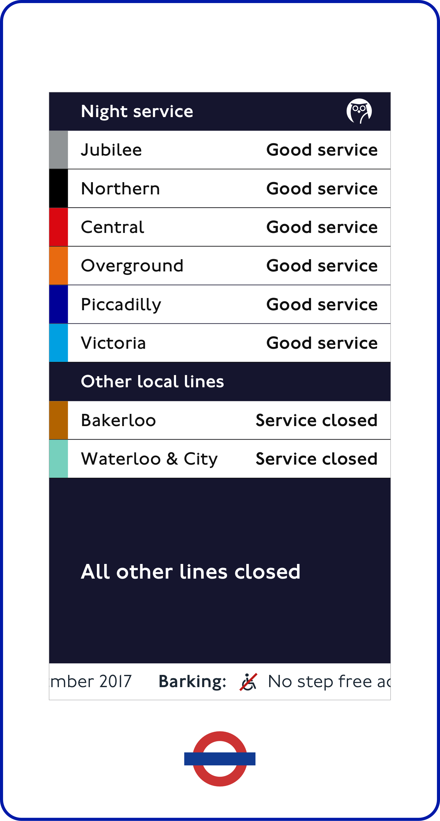
Night service
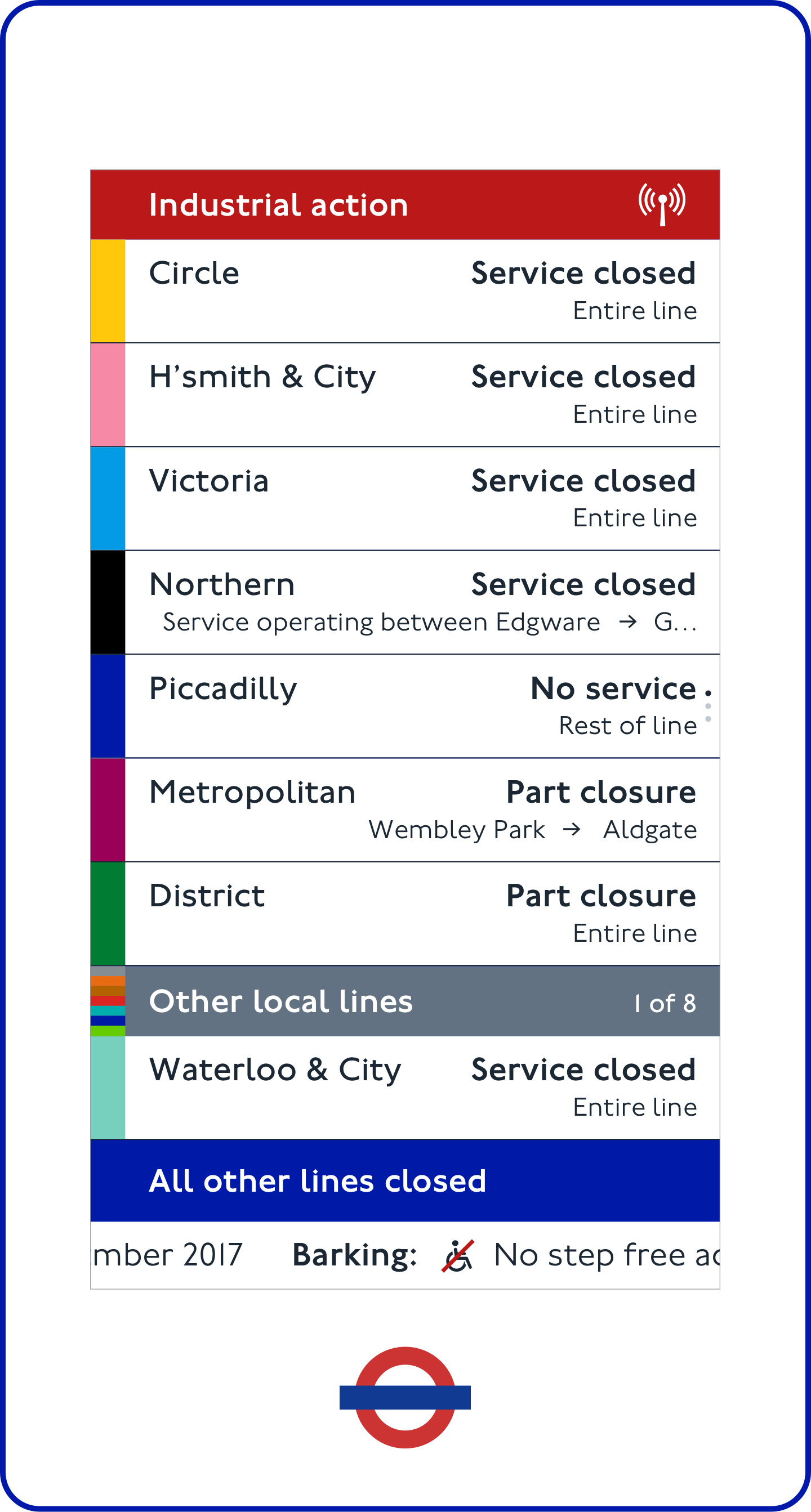
Industrial action
The design system can also scale for useful information in future, depending on the location of the units and time of day.
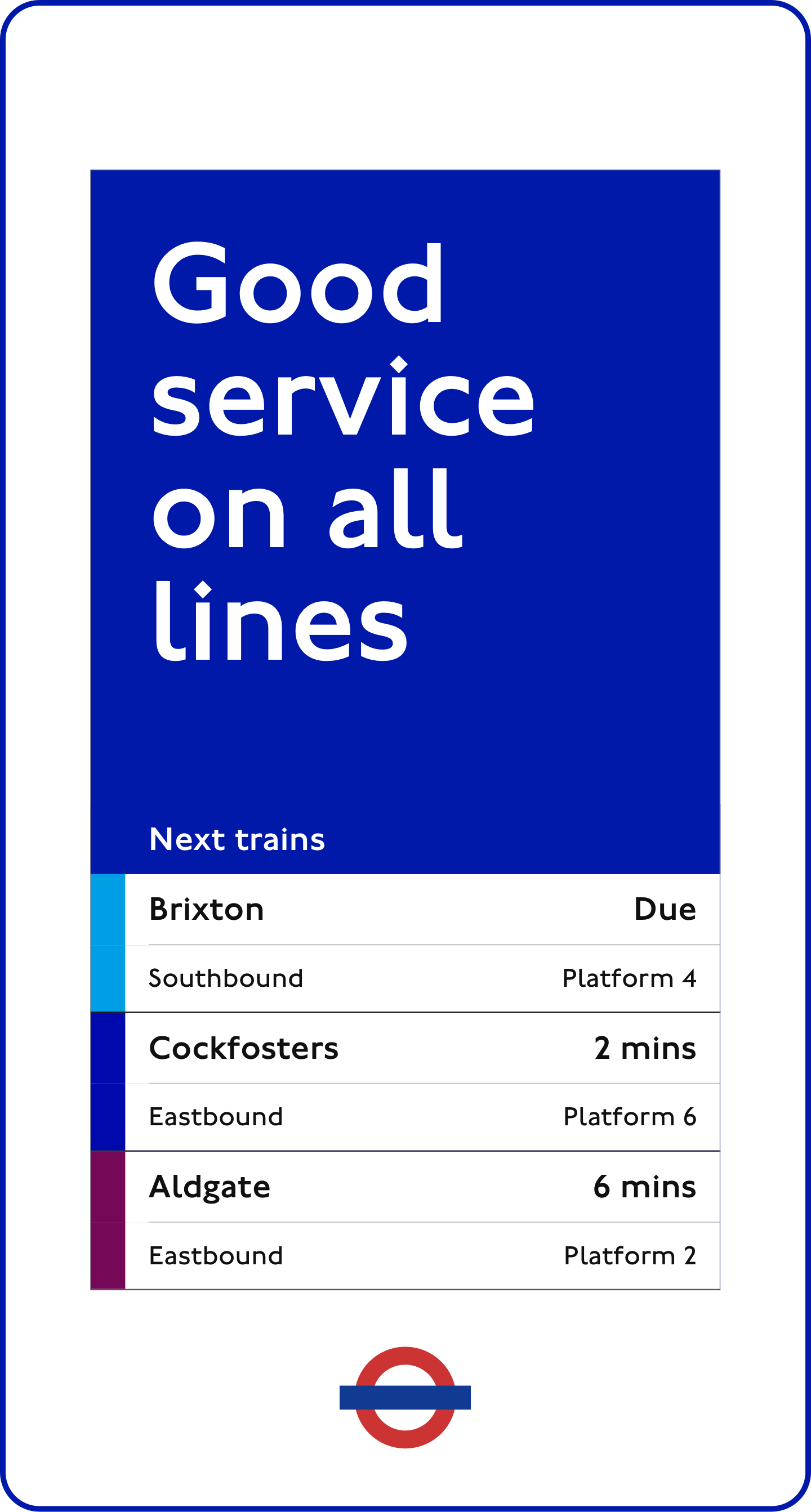
Next train times
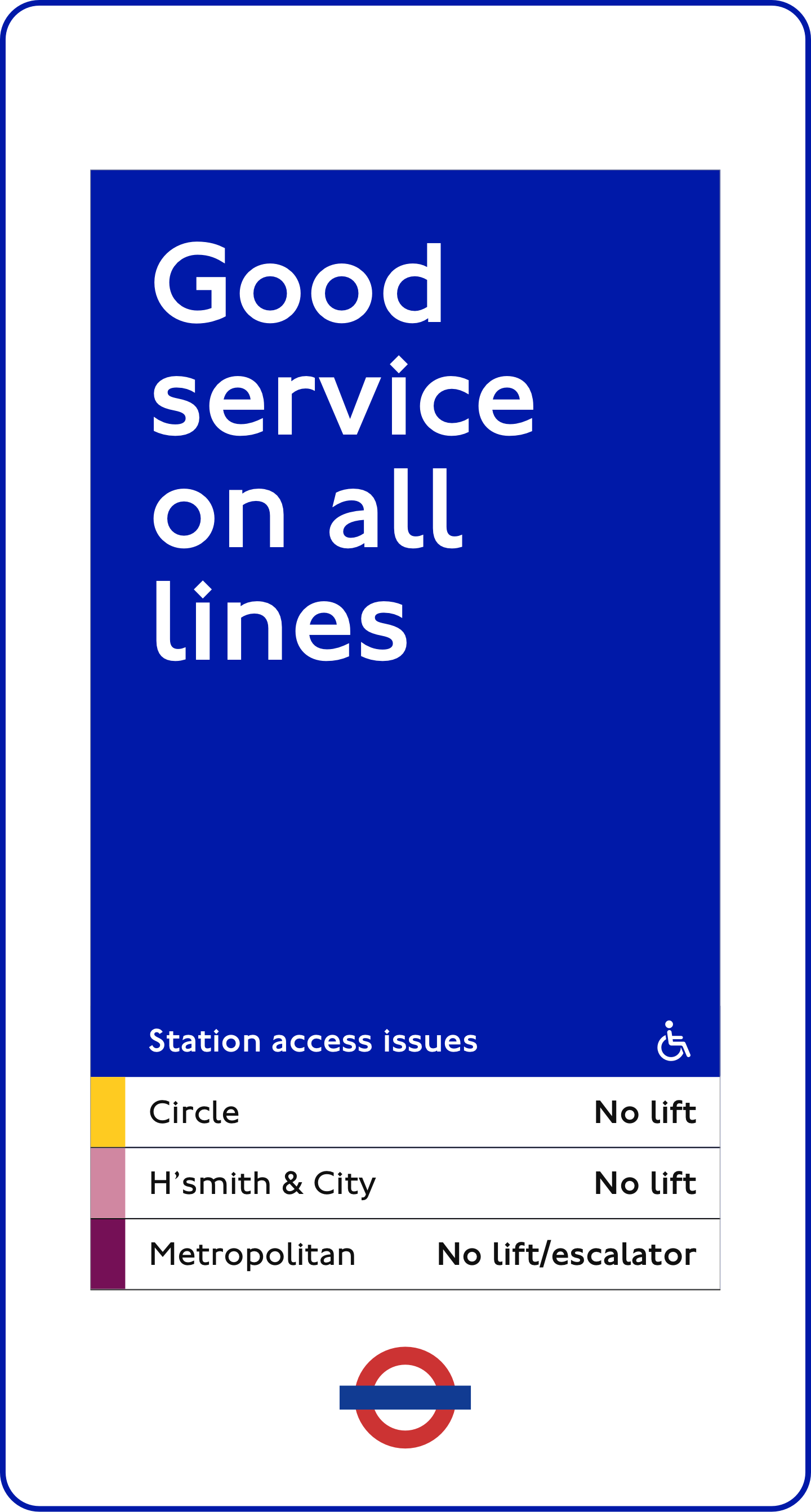
Station access
Mapping cards
The design system can support localised events. This builds engagement, enhances the customer experience and generates revenue.
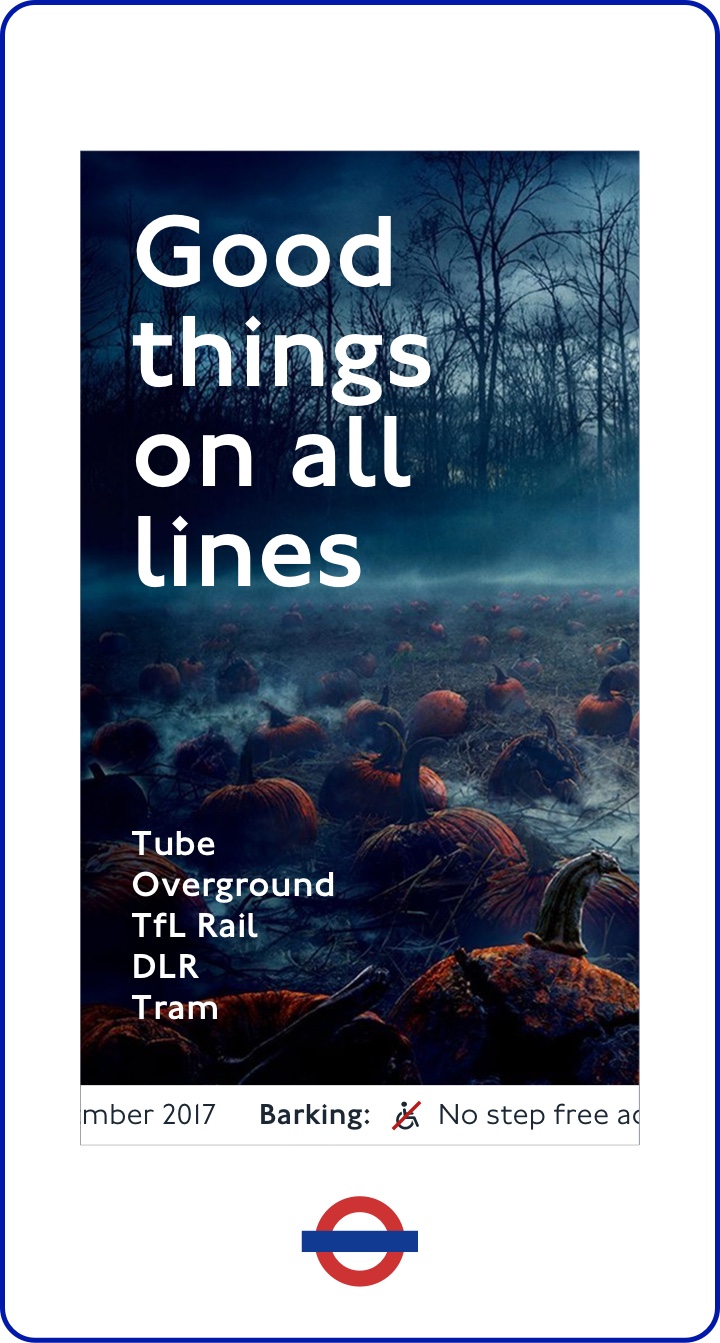
Stranger Things launch
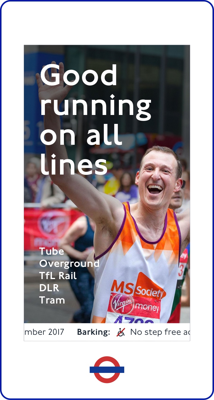
London Marathon
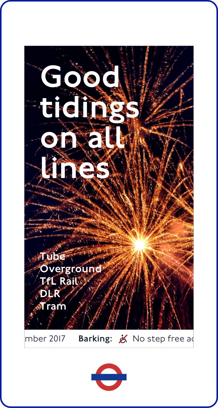
New Year's Eve
The live date is fast approaching, so watch this space. As the solution is rolled out, TfL will be monitoring the station environment to understand the impact of the new design system.
From a business perspective, TfL senior management were very pleased with the proposed solution and the approach to delivering information in the station environment.
New station display in West Hampstead ticket hall
In my role as Design Lead, I was responsible for all aspects of the design process detailed above. I also played a major role in facilitating collaboration and engagement with the key stakeholders throughout the process.